If you’ve been watching the livestreams ROBLOX does on Twitch, you may be aware that there was a new website layout coming out soon. Yesterday, it came out for the general public, and it’s just plain awesome! The organization is outstanding, and it looks very modern.
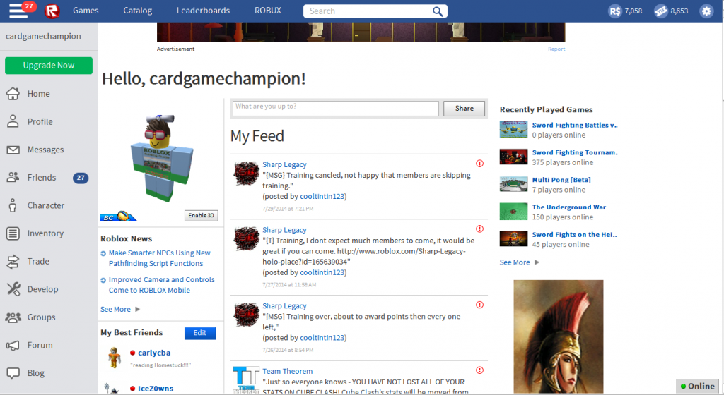
The new website layout, as you can see, looks a lot different than the old one. It’s organized a lot better, so you can get to things a lot quicker. It also looks less confusing compared to the old one, and that’s because the buttons are more separate. In the old layout, all the main buttons were in 1 spot, making it look a lot more complicated. This new theme is pretty self-explanatory, and organizes ROBLOX’s key functionality in a very nice design.
I really like this layout. It visually looks more modern than the old layout, while having a new design system that makes things a lot faster. One of the key things that makes it faster is that the Search bar you see at the top allows you to search in any category, the default being set to whatever page your on (EX: If you’re on the Games page, the default will be searching in Games). But, you can still search in any of the other categories that require searching (Forum, Catalog, People, Groups, etc.). This allows for really fast searching for anything you want, and is very nice and easy to use!
Another thing is that most of the features from the old black bar have been moved to a bar on the side. This makes the ROBLOX website look less cluttered and have a nicer feel. Another cool thing is that the button at the top left corner combines your messages with your friend requests, while the bar below keeps them separate! So at the top, if it says 5, you could have 2 Friend Requests and 3 New Messages. It’s like notifications, which is really neat! Now you’ll know whenever you need to check your friend requests or your messages in one spot, which is really nice!
Overall, the new ROBLOX layout is amazing. Easy to use functionality combined with a more modern look and feel make it the best website theme yet!
What do you think of the new layout? Is it good? Is it bad? What do you like about it, or dislike about it? Feel free to leave a comment!
Have fun playing with the new layout!
— cardgamechampion, author of “ROBLOX Building Guide”.
